· Tutorials · 3 min read
Why Print Doesn't Match Your Design File: 3 Causes
Print color doesn't match your design file because of gamut, the shop's ICC profile, or a miscalibrated screen — three technical causes and how to catch them with soft proofing before you ship the file.

The brand kit looked fine in the client review — bright red logo, clean beige background. The offset print comes back and the logo is a shade paler, the background has a slight yellow cast. A design file not matching the print usually isn’t sloppy work at the print shop — it’s almost always one of the three technical causes below.

The file’s gamut is wider than the print shop’s
Design files are usually in Adobe RGB or Display P3, while offset printing can only reproduce around 70% of sRGB. Any vivid color outside the print gamut gets compressed into whatever range the shop can actually run — coming out paler and less saturated. A pure RGB red like #FF0000 simply doesn’t exist in the shop’s CMYK space.
How to check: in Photoshop, turn on View → Gamut Warning using the print shop’s ICC profile. Any gray area that appears is the part of your file sitting outside the printable gamut. See color gamut: sRGB, Adobe RGB and DCI-P3 if you want to go deeper on this.

The wrong ICC profile for that shop
Every print shop, and every paper stock, has its own ICC profile. Glossy coated stock typically runs FOGRA39 or GRACoL2013; uncoated stock runs FOGRA47 or PSO Uncoated. Using GRACoL for an uncoated job is wrong from the start — the whole file comes out a shade pale, evenly across every color.
Ask the shop for the exact profile they run for your paper stock, and embed it into the CMYK file before you send it. Don’t leave Photoshop’s default “Adobe RGB → US Web Coated” in place. If you need a refresher, what is an ICC profile covers the basics.
The design monitor is out of calibration
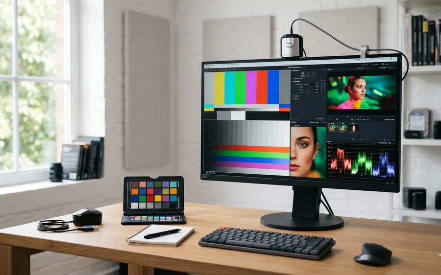
This one’s the hardest to debug, because the designer has no way of knowing they’re looking at the wrong colors. A BenQ SW271 that’s been running for two years will typically drift the red channel’s gamma by about 0.05–0.1. A designer used to that screen will nudge the logo until it “looks right red” — except the file is actually darker red than intended, and it prints even darker.
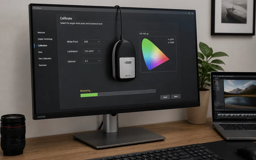
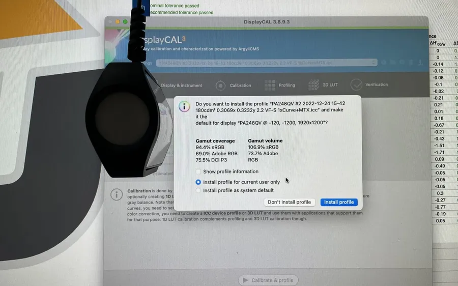
Quick test: open the same file on an iPad Pro or a recently calibrated screen. A visible mismatch between the two means the design monitor needs to be re-measured with a probe — a Spyder X or i1Display Pro — to find its actual gamma and white point.

Soft proof before you ship the file
In Photoshop: View → Proof Setup → Custom → select the print shop’s ICC profile. Use “Relative Colorimetric” rendering intent for clean vector logos and type, “Perceptual” for photos with skin tones or gradients. Toggle Ctrl+Y to preview how the file will actually print.
This isn’t a guess — Photoshop applies the exact color conversion the print shop’s process will use. A design-versus-print mismatch is usually caught right here, before you burn a thousand misprinted sheets.
The first two causes are a 10-minute fix once you have the right profile and soft-proofing set up. The third — a miscalibrated screen — needs recalibrating back to 6500K, gamma 2.2.
You can also run the online color test on your screen first, or see the calibration service.